

Tableau and Power BI for Data-driven Decision Makers
A data analysis and data visualization class for people who aren’t data scientists!
With more and more data being collected every day on everything, having the skills to analyze data and showcase your findings visually is becoming an important part of many job roles - job roles that are outside the standard list of data science-related jobs. If you’re a manager, project lead, researcher, or anyone who works with data, uses data to make decisions, or reports data to stakeholders, executives, or clients, or participates in any aspect of sales, the skills to analyze data, and present findings with compelling visuals is how you can make your point, justify your project, or win the client. We created this class for people like you. Professionals who aren’t data scientists get reports or raw data that they must digest, analyze, and report on. Give us one day, and you won’t be creating charts in Excel any longer.

Download this class brochure which includes:
Who should take the class
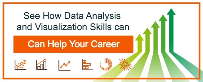
How data analysis and visualization skills can help project managers
3 ways data analysis and visualization skills can help any career
How to choose between Tableau and Power BI
Common questions answered in the class

Chapters
Keep scrolling or click a link below to jump to a chapter you're interested in.
CHAPTER 1: Tableau and Power BI for Data-driven Decision Makers
CHAPTER 2: Who Should Take a Data-driven Decision Maker Class?
CHAPTER 3: How Data Analysis and Visualization Skills Make You a Better Project Manager
CHAPTER 4: 3 Ways Data Analysis and Visualization Skills Help Any Career
CHAPTER 5: Which to Choose: Tableau or Power BI for Data-driven Decision Making
CHAPTER 6: Common Questions Answered in Data-driven Decision Maker Classes
CHAPTER 7: Conclusion
Tableau and Power BI for Data-driven Decision Makers
We've written a new set of courses designed to meet the needs of a growing segment of professionals today, people who work with data all the time but are not in data science job roles. These people might be project managers, recruiters, financial analysts, IT professionals, healthcare professionals, or anyone who gets raw data or reports containing data visualizations. We call these professionals data-driven decision-makers.
People in these roles have to review analysis, respond to it, perform their own analysis based on their specific job role, and make decisions. Often times they need to present those findings in order to explain behaviors, justify operations, and get projects approved. The problem is people in these non-data science job roles are often not trained to use data analysis and data visualization tools. That’s how we’re going to start, by explaining how these courses address that gap and the skills that you will learn.
The Tools Covered in the Classes
Our consultancy focuses on Microsoft Excel, Tableau, Power BI, and Python because they're popular and powerful
Familiarity with Excel is a requirement for many professional jobs, and most people are familiar with Excel, although they may need help performing data analysis and creating visualizations with Excel. Python is for serious data science applications. Tableau and Power BI, on the other hand, are powerful and robust data analysis and visualization tools that, in many organizations, are used by people who have not been trained with the software.

Screenshot from the Tableau class.
Tableau and Power BI have a much steeper learning curve than Excel. Once you have the training, it's easy to perform deep analysis and create rich, compelling data visualizations, so we've focused on those two apps.

Screenshot from the Power BI class.
Organizations often invest in training their data analysts but not the people who get the reports and visualization from those analysts. Many of those people don't have the time to self-train or even play with the software to become familiar with it. In many cases, professionals export data from Tableau and Power BI back to Excel because they're more familiar with it. That's why the two classes in this series focus on Tableau and Power BI, Tableau for Data-driven Decision Makers and Power Bi for Data-driven Decision Makers.
The Inspiration for These Courses
These courses were written to address a need we saw in our consultancy. Many project managers, directors, and other decision-makers would show us reports in Tableau and Power BI and ask us simple questions:
Can I annotate this visualization to explain the data it shows?
How do I drill into this data to see a different level of detail?
Can I look at the raw data this visualization is based on?
Can I copy this visual and change it so it focuses on information that pertains to my role?
How can I create a new visualization with the data here?
And too many interface questions to mention.
We designed this course to answer all of those questions and more by giving you a one-day, deep dive into the software, using relatable examples in lots of hands-on activities.
Broad Goals of the Course
You can view the course Tableau and Power BI syllabus to see the detail about what's covered in the courses, but in general, when you walk out of this class, the software will no longer be a black box. You will know how to navigate and utilize the powerful features of these apps. You will be able to analyze the data and reports you're given, customize them, and create your own. If you have the data you need, you won't have to ask the analyst to create new reports for you, you'll be able to do that yourself in a few minutes. You won't need to export everything to Excel, and you'll be able to easily turn data into compelling visual reports that focus on the information most important to you, help justify your decisions and get your requests approved.
So the next question is; Who should take this class?
Who Should Take a Data-driven Decision Maker Class?
We’ve already mentioned some jobs, such as project manager, that will benefit from these classes. Now we're going to drill into that topic a little further and discuss a variety of jobs where data analysis and data visualization skills can help your career.
What Jobs Need Tableau and Power BI Skills
To ask the question a different way, who can benefit from data analysis and data visualization skills? A short list would have to include:
Project managers
Project directors
Scientists (data and every other type)
Engineers
Healthcare professionals
Researchers
Computer security analysts
Financial analysts
Most other types of analysts
Security traders
Realtors
Accountants
Quality control engineers
and...
Anyone reporting data to stakeholders, executives, or customers, or using data to make decisions.
Simple Questions
For us, the title of your job doesn't matter. It's about what you do, and how you work with data. If you get reports or visuals in Tableau or Power BI that you have to interpret, comment on, or make decisions with, what are your answers to the following questions:
Are you able to drill into the data in those reports and visuals to your satisfaction?
Can you take the data and reports you're given in Tableau and Power BI and analyze them based on the unique perspective of your job role?
Can you do it without exporting it to Excel?
If you were asked to customize a report or create a new visualization to present findings based on your role using Tableau or Power BI, could you do it?
If you answered "no" to any of these, you might be a good candidate for this class.
As you can see, these skills can help in a large number of roles and career paths, but we think these skills are a must-have for project managers and managers of all kinds.
How Data Analysis and Visualization Skills Make You a Better Project Manager
We find that project managers and managers of all types generate and work with a lot of data and can benefit from data analysis and data visualization skills. The data they have might be related to hours worked, costs and budget, and many more types of project-specific data, and we’re going to show you how these skills can make you a better manager.
The Essential Value of Project Managers
Project managers are charged with bringing internal and external projects to successful completion on time and on budget. Along the way, they have to look out for organizational priorities and take care of the people working for them. They have to lead, communicate, manage resource time and team needs and think critically to solve problems.
How Data Analysis and Data Visualization Skills Make Project Managers Better
Project managers can use data analysis skills to analyze the volumes of past and current project data they collect to optimize all aspects of projects and improve their management of projects and their budget and resources. This process, known as project data analysis, helps project managers make estimations about hours required to complete tasks, anticipated costs, and circumstances that can adversely impact the project. This helps them make better decisions and more accurate predictions about costs, timelines, and budgets and correct problems more quickly.

This knowledge, in turn, helps project managers communicate more effectively to the people working for them, vendors and suppliers, stakeholders, and budget owners.
Both graphics are screenshots of visuals students build in the Tableau for Data-driven Decision Makers class!
Data visualization skills help project managers show what the data is saying in compelling visual reports and presentations. Project managers can also set up project dashboards to track key performance indicators and progress toward milestones. All of this helps keep project stakeholders better informed.
No matter what your job or role, there are three ways these skills will help you!
3 Ways Data Analysis and Visualization Skills Help Any Career
In organizations that collect and analyze data, having the skill to perform data analysis and create visualization can boost your performance and your career. In this article, we're going to look at three key benefits of using data analysis and data visualization skills to make decisions, report results, and justify your activities.
Making Decisions - Finding the Insights Most Important to You

If you have raw data or if you get analysis from an analyst, data analysis skills can help you find insights that are most important to you. You might be thinking, "I have an analyst for that." But you don't have an analyst, the organization does. Data analysts often perform analysis based on broad organization goals and initiatives. Your role, your team, or your project may have a unique perspective.
For example, the organizational data analyst might create reports related to product sales generally, while a product manager might be interested only in the sales of the project they manage. The data analyst might create reports on returns and customer satisfaction, but the engineering team may want more detail on products returned due to a lack of features versus defects. Regional managers may get all kinds of data analysis and reports from corporate but may only be interested in data about the region they work in.
While you might be able to ask the data analyst for new reports, often, that doesn't work out so well. Organizational data analysts have a lot on their plate and must prioritize requests from organizational leadership, they might not have time to prepare unique analyses for you. Furthermore, analysts don't likely have specific domain knowledge about your role, team, task, or focus area and so aren't best equipped to look for insights that are meaningful to you.

You can take a huge report on all your company products...

…and refine it to show the comparison of youth products you're interested in.
You have the data and the domain knowledge. If you get familiar with the tools like Tableau or Power BI, then you can analyze the reports you're given, drill in to get more detail, filter them to see only the information you're interested in, or create new reports using only the data that matters to you. Even better, you can do it whenever you need without having to wait for the analyst to get back to you. You can find the insights that matter most to you, stay well-informed, keep stakeholders up to date, and make better decisions faster.
Reporting Results - Telling the Story You Want to Tell
In addition to having data analysis skills, if you can modify data visualizations (those reports the analysts give you) or create your own, you can apply your own analysis and tell the story you want to tell.
Sometimes this is very simple but very important. A simple annotation on a simple data visualization like the one below can make the case for a new employee.

Being able to annotate and customize reports lets you share your perspective and insights and takes the guesswork out of the visualizations. In the case of the visualization above, when it's presented to stakeholders, there's no guesswork needed. The explanation is included with the visualization.
The ability to customize, annotate, and create your own visualizations lets you put your own spin on reports and visualizations, allows you to explain your perspective to others, and helps you tell the story you want to tell.
If you want to be an influencer in your organization, you’re going to have to show your work. Data visualization is how you do that." - Bob Carver
Justifying your Activities - Getting a Yes
Those two skills, the ability to perform analysis and customize and create visualizations, give you another superpower, it helps you sell. What? You say you're not a salesperson? Let me ask you this, do you ever:
Submit a budget for approval?
Try to get projects or initiatives staffed and funded?
Have to explain the value your team, your product, or your service provides?
Make presentations to clients, partners, or executives?
If you do any of these things, you're doing sales. When you're asking for something, showing the data that your decision is based on is like showing your work. It shows you're thoughtful, it shows you've done the analysis, and it provides facts to approvers that back up what you're asking for. That can be the difference between yes, and no.
Which to Choose: Tableau or Power BI for Data-driven Decision Making
We wrote two versions of the data-driven decision-maker courses, one focused on Tableau and the other on Power BI, so one of the common questions we get from prospective students is; Which course should I take? We’ll help you try to find the answer to the question and make the choice that’s best for you.
Is Tableau or Power BI Preferred in Your Organization?
The first question to ask is, does your organization use Tableau or Power BI already? If they do, you should get details about how it's used and obtain a license so that you can use it. That's going to be the path of least resistance to getting data analysis and visualization software, especially if the software is deployed at the organizational level with infrastructure for sharing data and visualizations security.
Many organizations have not made an organizational choice for analytics tools, and different teams may have different software. You should poll the teams you work with to see which app they prefer, as that could guide your decision.
Is Your Organization Actively Using a BI or AI-driven Analytics Platform?
Beyond having licenses, does your organization have a preferred analytics platform or stack? An analytics stack is a collection of applications, online services, and other integration components designed to collect, process, and facilitate the analysis of data in order to extract value in decision-making. Power BI is part of the Microsoft Analytics stack, which ranks in Gartner's Magic Quadrant for analytics platforms. Tableau is part of the Salesforce CRM analytics. While both stacks can integrate with the other's software, if your organization has chosen one, that may impact the app you choose. Due to the data connect capabilities built into both Tableau and Power BI, however, you can still choose either app for your data analysis and visualization tool.
If you want to know when to use an app like Tableau or Power BI versus when to use Excel, or are curious about when dive deeper and use something like Python for data science work, check out our article: Choose the Right Tool for Your Data Analysis and Visualization Task.
Tableau vs. Power BI
If it's down to choosing one or the other, then you should do a little research because there are differences. We prefer Tableau, but you should check out the following links:
Power BI vs Tableau: Full Comparison (Note there is an inaccuracy in their table. It a says Tableau doesn't offer a query editor. It doesn't offer a query editor like you see in Excel or Power BI as part of the Tableau app, but it does as part of Tableau Prep and Flow, the robust data connection and cleaning tool that comes with Tableau.)
In most head-to-head comparisons, Power BI is considered easier to use, but Tableau wins in speed, data handling, and visualization capabilities.
Tableau is the more expensive option, so if you're worried about justifying the cost, see these articles:
Tableau does have a bit larger learning curve. That's why we created our Tableau for Data-driven Decision Makers class. Power BI isn't exactly intuitive right out of the gate, either. That's why we created Power BI for Data-driven Decision Makers. After this one-day class, you'll be over that learning curve, proficient with your software, and have practice using its capabilities.

Common Questions Answered in Data-driven Decision Maker Classes
The data-driven decision-maker courses give you a full day of immersive, hands-on experience with Tableau or Power BI. They’re designed to address the common knowledge gaps and frustrations with Tableau and Power BI by answering the following questions...


Conclusion
If you might benefit from these skills, or if you're looking to gain the superpower of getting your yes, contact us about our data-driven decision-maker classes. See our class schedule or reach out for a free 15-minute training consultation.
Download this content to share with your team.

